
Color Science Straight Out Of Camera
Producing a photograph straight out of camera with uniquely tuned color grading has reduced my post operations to a simple matter of making the selects ready for print. Ready for print to me is a matter of minor adjustments to brightness, contrast, saturation, sharpening for viewing distance if necessary – image qualities that differ most between screen and print presentation.
These nine images developed with nine digital films are a testament to Fujifilm’s built-in color science and an exercise in compare & contrast. All images were shot RAW and developed in-camera using specific imaging parameters needed to produce a desired film simulation.
The films chosen represent my personal photographic aesthetic using Kodak analog media. These simulations have been designed to mimic those classic Kodak emulsions, resulting in a unique digital interpretation of these nine images over nine films.
Color science has evolved to a point where straight out of camera images produce the qualities I look for in post, increasing my time outside creating photographs while reducing my time inside developing a picture.
A special thank you to Ritchie Roesch at FujiXWeekly.com for his research and creation of an extensive library of digital films, where “you take it out of the box and the pictures are already brilliant”.
Enjoy the exercise,
Eric Anderson
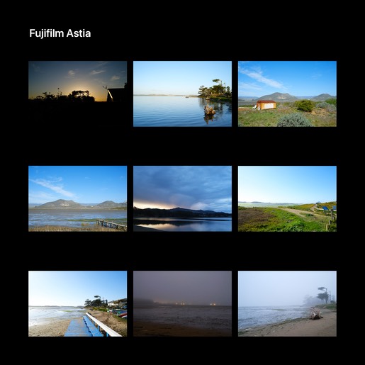
Fujifilm’s Astia (1997) is a daylight balanced color reversal film with high color fidelity and boasts smooth natural skin tone reproduction. Neutral color rendition and exceptionally fine grain from the highlights to the shadows make this film a happy medium between ultra-saturated Velvia and the Fujifilm color aesthetic of Provia.
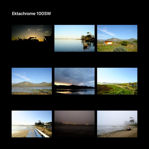
First released in the early 1940s, the fine grained Ektachrome has a distinctive look that became familiar to readers of National Geographic, using it extensively for color photographs in settings where Kodachrome was too slow. Colors are more up front and saturated compared to Kodachrome, vibrant without appearing artificial or overcooked.
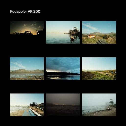
In 1942 Kodak’s Kodacolor was the first true color negative film intended to produce paper prints. There have been many varieties of Kodacolor over time, this particular version is modeled after the 1980s Kodacolor VR 200, reproducing a classic fine grain Kodak analog aesthetic. This film was not especially tolerant of under exposure and over exposure tended to produce cyan skies. This digital film is precisely that – Kodacolor VR 200 that’s been slightly overexposed.
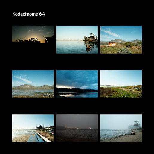
Manufactured for 74 years until its discontinuation in 2009, Kodachrome was the oldest surviving brand of color film. The most iconic film ever made, it was used widely everywhere, especially for images intended for publication in print media. In 1974, to Paul Simon’s joy, Kodachrome 64 was released. National Geographic photojournalist Steve McCurry noted “…It had a great color palette … wasn't too garish … had more poetry in it, a softness, an elegance … With digital photography, you gain many benefits but you have to put in post-production. With this, you take it out of the box and the pictures are already brilliant“.
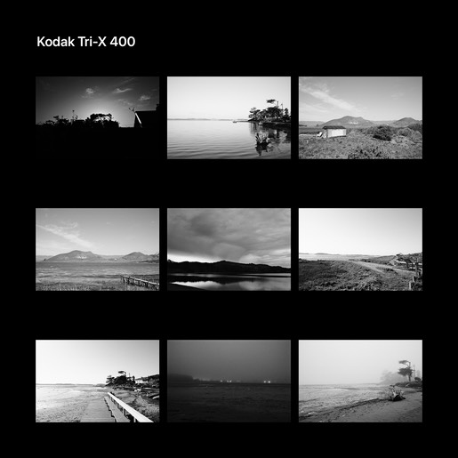
The preferred film, of all film, in all of history, for all types of photography, on this planet Earth, Kodak’s timeless black & white Tri-X. Strong praise well earned due to its beautiful and unchanged 1950s grain aesthetic, strong contrast with rich tonality, and amazing exposure latitude. Best to meter this film on mid-tones or even shadows. You don’t want to underexpose and it’s hard to overexpose, a design advantage to be exploited.
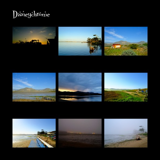
Tuned for a Kodak color aesthetic, modeled after Fujichrome Velvia (1990) and the short lived ‘make it go to eleven’ Fortia (2004). Kodak could have sold this ultra-high saturation film in their photography kiosks at the Happiest Place on Earth, filling the world with even more color.

Kodacolor VR (1982) faded over time, yellow & cyan dyes leading the charge, resulting in a forest green shift to developed photographs. This is a film stored a little past its expiration date, lost in a kitchen drawer someplace. Not too hot, nor too cold, just long enough for colors to begin shifting, a bit of contrast getting lost along the way.
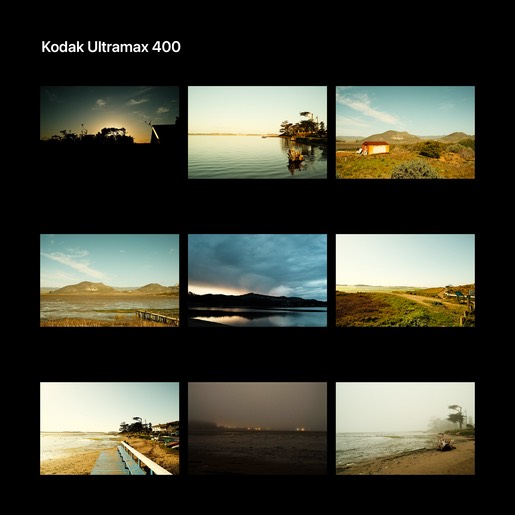
Introduced in 1997, Kodak Ultramax is a worry free, easy to use high speed film designed as a general purpose workhorse. This warm leaning daylight balanced Johannes Factotum provides a wide exposure latitude with excellent sharpness and fine grain for crisp, clear pictures in most any situation. Ultramax delivers consistently bright, vibrant colors with accurate skin tone reproduction.
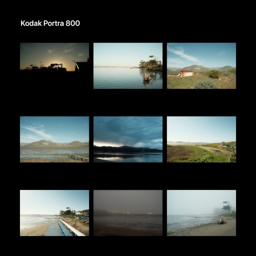
Kodak Portra is a daylight balanced color negative film released in 1998 mainly for portrait and wedding applications. Portra is the successor of Vericolor which in turn succeeded Ektacolor and is known for its soft and subtle renderings of color and contrast, being true to both.
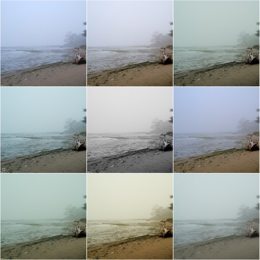
In a grid, these are the nine images on a per-film basis. The order of the films are, left to right, top to bottom:
– Astia, Extachrome, Kodacolor
– Kodachrome, Tri-X, Disneychrome
– Kodacolor VR (expired), Ultramax, Portra
Some Notes:
- Comparing film renderings side-by-sdide can be unflattering to all the renderings. A collection of images tend to look their best when seen using the same film style.
- Note the transition of bright to darker skies. Some film renderings tend to move quickly from white-ish to blue-ish.
- Images were chosen to bring out the strengths and weaknesses in the ability of the film simulations to render the image.
Image #1:
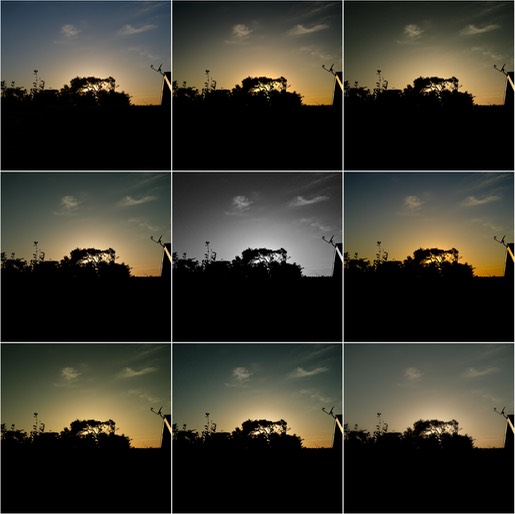
Image #2:
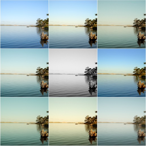
Image #3:
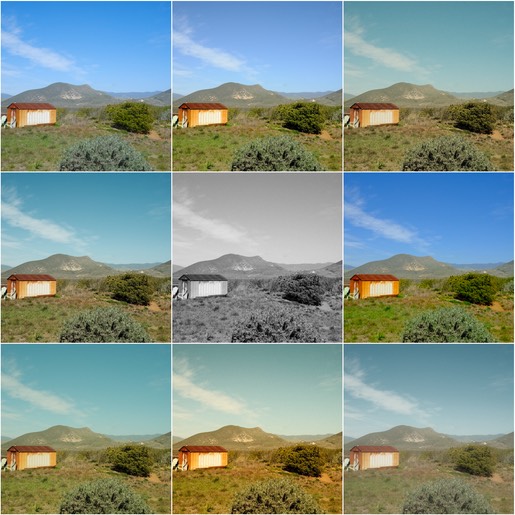
Image #4:
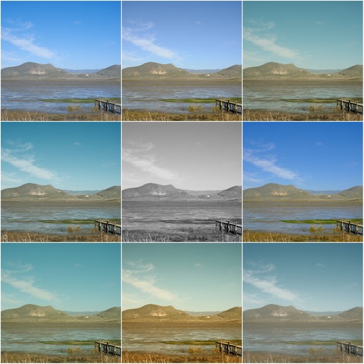
Image #5:
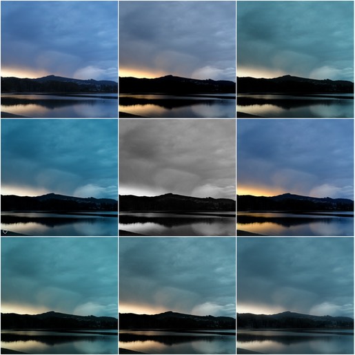
Image #6:
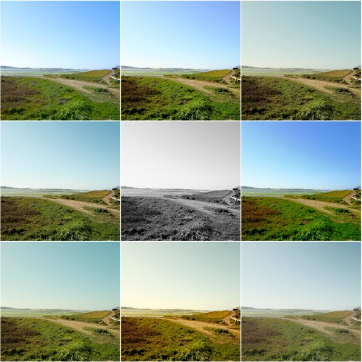
Image #7:
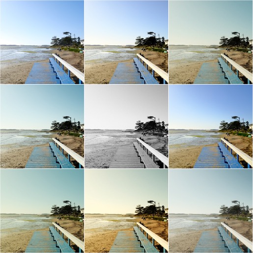
Image #8:
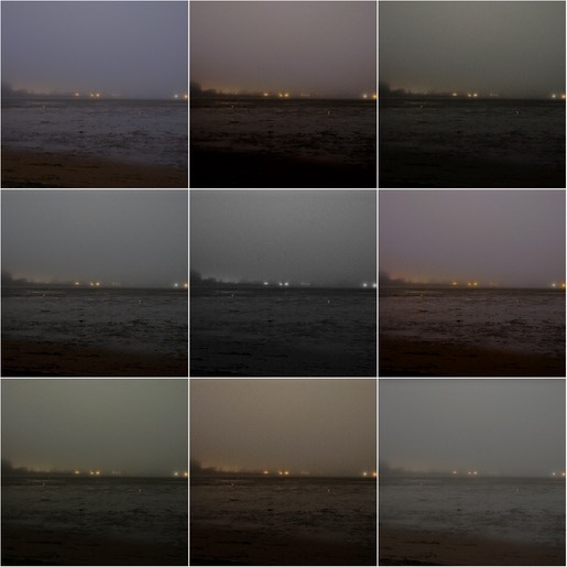
Image #9: